Technically Pleasing? – Designing with both sides of the brain.
Technically “pleasing” is a term often used when describing good cover art – but what exactly does this mean? Reaching customers through graphics comprised of copy and images needs to marry these two very different ways of expression. It is this marriage of words and images (concepts) that requires a technician as well as an artist to achieve corporate success. This is why writers have editors and artists have directors. Sure, it is true that art directors are generally experienced artists and many editors are capable writers – They are simply professionals who have applied themselves to the technical aspects of the job, it is this marriage of the “technical” with the “artistic” that Art directors and editors must master. This is truly a battle which has often been incorrectly referred to as “Left” brain vs “Right” brain. Countless books have been written on the subject but there is one classic standard by Keirsey called “Please understand me II” which breaks down the undeniable 16 base human temperaments.
According to Keirsey what is often refered to as Right Brain simply refers to abstract thinkers and Left Brain refers to those who view their world in more concrete terms. Lets take two very similar appearing (on the surface) temperaments, one is abstract and the other is concrete. ENTP’s and ESTP’s respectively are viewed and seen by the world similarly, both are often highly capable marketing / design or copy professionals. Research has shown that a primary difference between these two personalities seems to be ones preference for words versus images (concepts). the Abstract marketing individual seems to excell and often prefer visual information versus the Concrete thinking individuals preference for words (ESTPs’, though concrete in their thinking preferences are highly artistic individuals – with language you can think of them as “word artists”) These two temperaments share Extroversion and Perception in their preferences and seem to base their decisions not on their own internal preferences but on what they externally perceive their ” audience” is needing or is in search of . This externally focused mindset (one for images, the other for words) was possibly best described in the classic book The Marketing Imagination, New, Expanded Edition by Theodore Levitt. Please be sure to understand, that NO personality has a lock on “The marketing imagination” All 16 base personalities have an incredible ability to learn and apply the “technical aspects” of the marketing mindset – they are only limited by their personal will. No where was this more apparent then with Timothy Ferriss, Author and marketing guru, whose sincere honesty in his first mega blockbuster book “The four hour work week” describes his naivete’ with some of the most basic of marketing instincts that come natural to ESTP’s and ENTP’s. Ferris describes how he could not initially grasp concepts which he learned from his mentors early in his career. But once he put these “abstract” concepts to work and verified their success in the marketplace – he like no other researched, quantified and documented these concepts and achieved unprecedented business success.

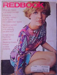
1960’s early 70s – Photographers were king. Article information was subdued in small fonts. Each cover followed direction from the photo (PLEASING)

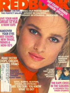
1980’s – Attack of the word monster. Art takes a back seat, even the “corporate” logo is reduced in size. Content editors have been put in charge (BLAH)

1990’s – Design by commitee! every one got their hands on this one. Too much logo, too much photos, & too much copy. Blah,Blah,Blah

Today / 2011 – well branded logo takes a back seat, Both photography and copy are in good proportions. (PLEASING)
“Pleasing” or “Blah / Boring” is the subconscious instant reaction one gets when viewing a cover design or or any marketing piece for the first time – it is not just the professional copy writers or artists who are aware of this, but everyone – every consumer makes these subconscious instant decisions every day. Achieving this “pleasure” as oppose to “Blah” or “Boring” from our one page marketing statement is surely foremost on the minds of art directors everywhere, and for those whose publications have evolved into word “monsters” there should be a concerted effort to tame the Beast. Here’s a wonderful thought experiment, what would happen if once a year a magazine such as Redbook would put their efforts into the “perfect” photo based cover design with only one short ad copy or possibly none at all? How would newstand sales react? could it be sustained more than once a year?
let me know your thoughts and ideas. you can contact me at
milton@pretenderstrategic.com
Milton Fleitas


